Lockdown 3: Art Series

As the weeks of Lockdown 3 drag on here in the U.K., some of us may be feeling more removed than ever from culture. As the doors to our wonderful Museums remain shut for the time being, we can but dream of those rainy afternoons spent walking their galleries. With that in mind, I'm bring a tiny slice of the Museum to you by continuing the LoveNotes Art Series I started in Lockdown 1; taking a virtual look at some of Britain's incredible art. Oh, & then pairing the art with one of our bags, for a bit of fun!

Peter Doig (born 1959) Concrete Cabin, ca. 1995 -1996, Private Collection. View other artworks from the Concrete Cabin Series on the Tate's website.

Peter Doig (born 1959)
Concrete Cabin, ca. 1995 -1996, Private Collection. View other artworks from the Concrete Cabin Series on the Tate's website.

Arguably Scotland's greatest living artist, Peter Doig created a series of nine works called 'Concrete Cabin' between 1991-98. This particular piece in the series was painted between 1995-96.

Moving through a sun dappled forest towards a man-made structure, Doig's painting of Le Corbusier's classic modernist apartment block offers an almost touchable utopia. The clean, geometric architecture appears like a mirage through the sinewy undergrowth. Conceived as an ideal living space opened in 1961, the apartment block fell into disrepair and was derelict by 1973. Through Doig's eyes, the fragments of the apartment block could be anywhere and yet nowhere; it looks strangely familiar and unrecognisable in equal measure. In this light, the block still radiates a habitable warmth, although the forest is beginning to encroach the block still owns its space; nature hasn't yet taken ahold. In other paintings from the series, the tangled, dark forest is engulfing the structure. These paintings have a Bladerunner quality about them; what was once built by humans as a utopian beacon for modern living has fallen into dystopia, a concept that has fascinated writers and artists for centuries. Perhaps Doig's 'Concrete Cabin' series serve as a stark warning to pay attention to the society in which we live and to be aware of how things can go from bad to worse.

ART PAIRING | For Peter Doig's 'Concrete Cabin', a landscape where the man-made & the natural converge, I have chosen our PORTOBELLO Monochrome bag. Here, the natural undyed hair-on-hide panel contrasts with the sleek, hand-worked leather. Monochrome is a big trend for 2021 & this Other Stories Cardigan seems the perfect easy-wearing item to pair with our Portobello bag.

In a similar way to Doig's juxtaposition of utopian & dystopian visions in this series, Alexander McQueen are the rulers of contrast in the fashion stakes; often bringing together the soft & romantic with hard punk / S&M details. This pure cotton tunic dress & leather harness belt are the fashion equivalent to Doig's 'Concrete Cabin'.

SS21 Mood Board

SS21 Mood Board

QuarARTine

For many of us, 2020 has been quieter than we ever imagined. I don't know about you, but the range of emotions I've experienced in this time have been pretty diverse! From worry, fear & at times even anger, through to overwhelming love & gratitude. 

When I look back on this strange old time, the moments that have brought the most calm have been when I had a brush in hand, painting little nature studies.  A cliché lockdown pastime for sure! I haven't painted regularly since I was teenager & although I'm not going to win awards for my painting skills, observing nature in this way inspired this new jewellery collection.  Each of my painted lockdown leaves also feature on the packaging  of each necklace in my new Celtic Zodiac range - a little memento from quarARTine!      

IMG_20200729_220053_013.jpg

"It is only when we are no longer fearful that we begin to create" - J. M.W. Turner.

Whilst the U.K. is in lockdown & we're unable to visit museums & galleries it seems a good time to explore some of Britain's incredible art on LoveNotes, whilst pairing them with our bags of course!  

Turner_Staffa

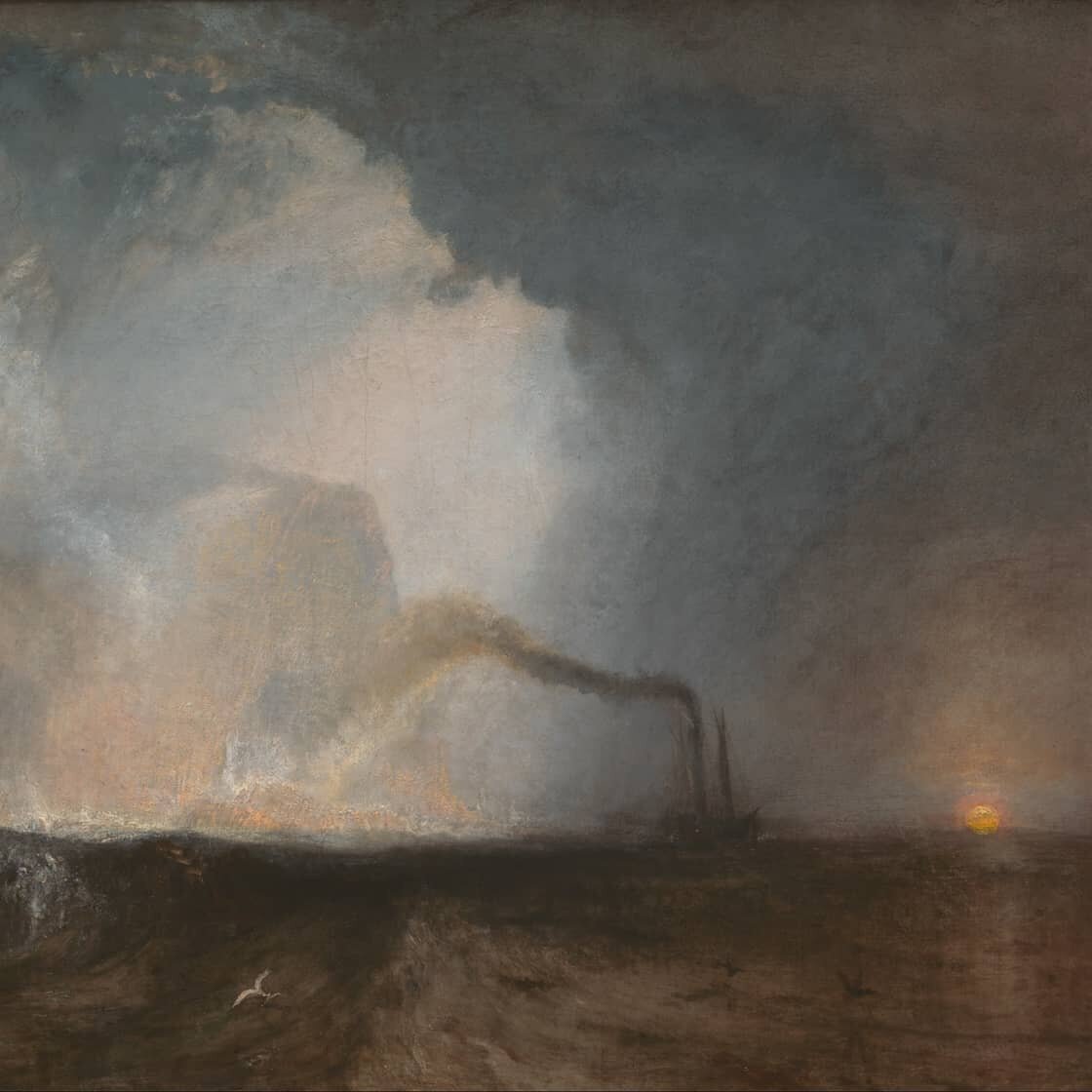
J.M.W Turner - Staffa | 1844 | Tate Gallery

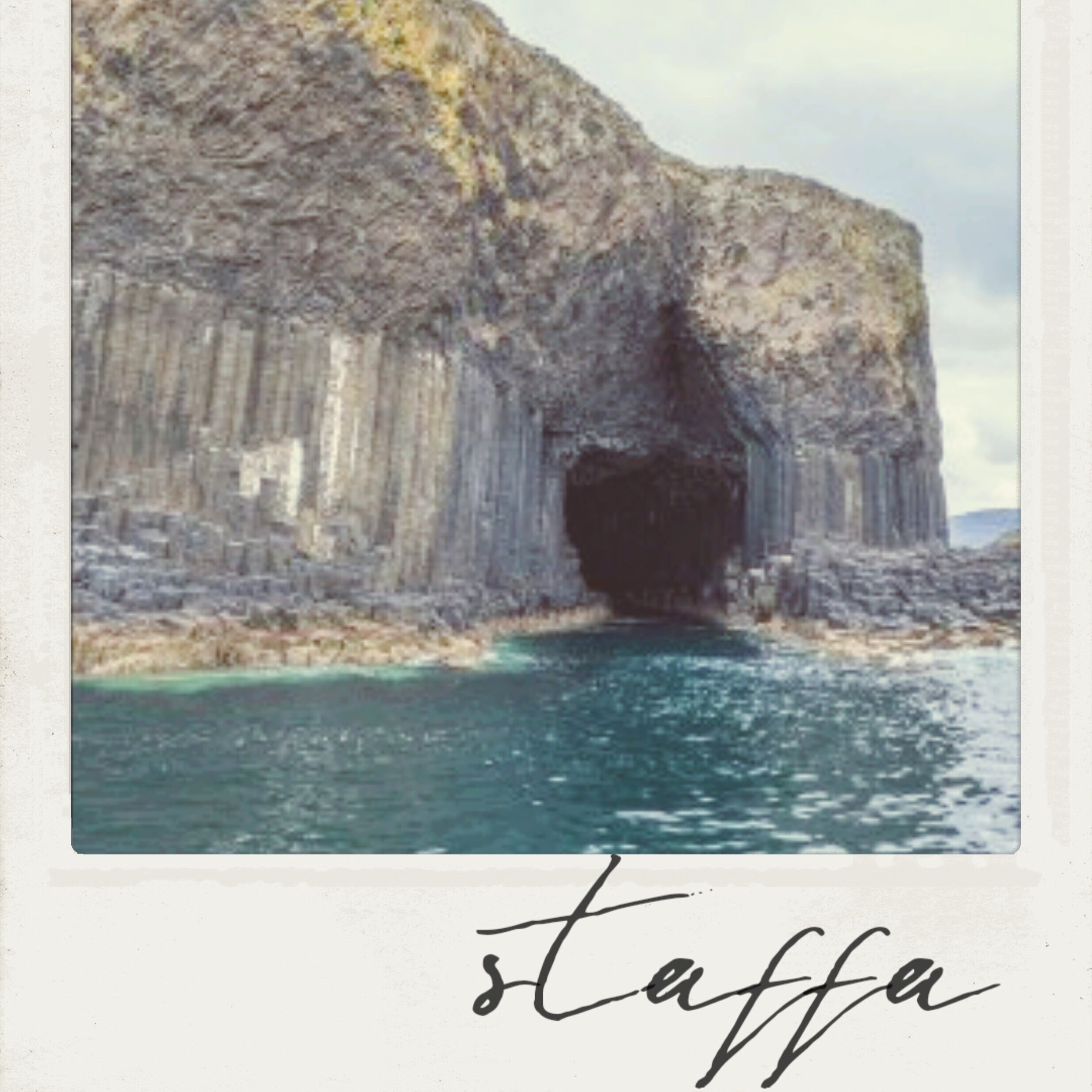
This could easily be compared to a late 60's Rothko painting but instead it was created 125 years earlier by Turner. It's a sketch in pencil & watercolour of Staffa, a tiny island off the west coast of Scotland.

Staffa, with its basalt columns rising out from the Atlantic, is an extraordinary geological site. Yet, it's not the unique rock formations which Turner is interested here, but rather the feeling of the place. That heart pang you get when a ray of light pierces through an opening in the cloud & in this case illuminates a cliff face. Turner's oil painting of Staffa (below, right) is a refined version of the sketch but there's something about the reductive & immediate nature of this watercolour.

In either medium, Turner's focus is the same; how colour & light play for & against each other to create an atmosphere. Transposing that atmosphere to paper & canvas, in a way that only J.M.W Turner knew how.

"It is only when we are no longer fearful that we begin to create"
- J. M.W. Turner.

Nixey_Turner-Staffa

Muted Spring tones inspired by Staffa's basalt rocks & Turner's study.

Nixey_turner

Queen Charlotte - Regal Feminist


As we are all housebound, we thought we'd use this time to explore some of Britain's incredible art & artefacts - whilst pairing them with our bags. This is how we find our fun these days!

Nixey_1834_Bonnie
Nixey_- Queen_Charlotte

FOREGROUND London Tan, Bonnie bag.


BACKGROUND A vase from Johan Zoffany's portrait of Queen Charlotte. German born Charlotte (1744–1818) was queen to George III; her granddaughter was Queen Victoria.

"I am of the opinion that if women had the same advantages as men in their education they might do as well." - Queen Charlotte


Evidence suggests Queen Charlotte was the first biracial member of the British royals, with her heritage stemming from black relatives of the Portuguese Royal family. 

Charlotte was regarded as an enlightened thinker of her time. She established one of the first maternity hospitals in Europe in 1739, which is still in existence as Queen Charlotte's & Chelsea Hospital. The Queen herself had 15 children, which possibly explains the need for a maternity hospital!

Scientifically minded she had a particular love for botany, as Zoffany's vase represents.

📸 This portrait is part of The Royal Collection Trust.  NIXEY is a proud supplier to Holyroodhouse Palace, a property of The Royal Collection Trust.

Frida Kahlo: Making Her Self Up

gettyimages-3249013.jpg

It’s a miserable November morning & I find myself queuing outside the V & A, huddled under a crumpled umbrella with a grumpy two year old. Why? It’s the final days of the Frida Kahlo exhibition & I’ve been meaning to go since it opened months previous. Parenthood brings innumerable joys but with a toddler those little self-indulgent pastimes (reading, working-out, visiting a gallery, drinking a warm coffee) are….compromised. In retaliation, I’ve dragged us here through wind & rain although so far it’s proving more hassle than it’s worth!

Stepping into ‘Frida Kahlo: Making Her Self Up’ is an instant reality check; my mornings “inconveniences” are put into stark perspective. Besides her talent, Frida’s life was marked by two extraordinary things: an almighty sense of self & daily crippling pain as a result of childhood polio & a near-fatal bus accident. Dying at 47, she spent her short life as a young woman in a decaying body held together by orthopaedic corsets & prosthetic limbs.

Alongside Frida’s art & photography, the show exhibits her intimate possessions which had been locked away since her death. Rigid body braces are contrasted with her exuberant wardrobe. Full skirts, billowing tunics & vibrant shawls in the style of Mexican National Dress serving to hide the constrictions she wore beneath. Yet the way Frida styled herself went way beyond mere functionality.

prosthetic-leg-with-leather-boot.jpg

Her self & her art were one in the same.

Artists often turn to autobiographical material in their work but with Frida it’s hard to decipher where the self stops & the art starts. Throughout her life she spent time restricted to bed rest & whilst most would find this physical isolation an artistic restriction too, Frida had a mirror attached to the ceiling & used her own reflection as inspiration for her work. Perhaps this intense time with her reflection is where she unlocked her power of self expression. From the photographs in the exhibition, she was captivating & more beautiful than her self portraits would suggest. Often emphasising her statement monobrow & facial hair in her art, Frida used her image to play with gender, sexuality & perceived ideas of womanhood. In our current “perfect selfie” culture, this still has the power to shock.

Frida-Kahlo-2-e1528888763967.jpg

Like Grayson Perry today, Frida looked like a walking art installation standing out wherever she went with her vibrant brocades & elaborate headdresses. Her love of indigenous clothing reflected her admiration for artisanship, her commitment to Mexico & her cultural identity. Here was a woman with very little power over her health, but the utmost control over the way the world perceived her. 60 years on from her death & her image is recognised the world over. As the exhibition title suggests, she made her self up & in doing so she created an icon.

I’ve thought about Frida most days since that rainy morning in November. Park her genius with a paintbrush for a minute (something I’ve barely touched upon here but if you are interested, check out Tracey Emin’s article ‘Frida On My Mind’) & just look at her relationship with clothing. Style for her was a communicator; like her art it told the world who she was & where she came from. It’s mind-blowing that despite her unrelenting pain & premature death, she was able to create a self image that, half a century on, is engrained in our everyday; replicated on cushions, tea towels, socks! Obviously, not many of us are as bold in our fashion choices as Frida. Style is a personal journey of experimentation & self expression; it’s exhilarating to push boundaries & it is reassuring to have trusty friends in our wardrobe which anchor part of our identity. Frida is testament to the fact that what we wear can be our armour, our comforter & everything in between. It is not frivolous, it is a visual language that tells the world a little bit about who we are & what is important to us.

Although the V & A exhibition has finished, if you happen to find yourself in New York this Spring then the Brooklyn Museum is hosting a version of the London show.

Frida_Nixey
chatty feet

Beazley Designs of the Year; The Top 3

Space Boot. Photograph: Victoria Jones/PA

Space Boot. Photograph: Victoria Jones/PA

What sets us humans apart from animals is our inherent curiosity.

Add this to our primal desire to make things & what started out a million years ago as a stone handaxe, today culminates in the Beazley Designs of the Year at the Design Museum.


Now in its 11th year, this annual extravaganza of ideas is like looking through a window into the future. A future of social consciousness, where supermarket aisles are plastic-free & you can grow a pair of space boots out of mushrooms using human sweat. Seriously!

Of the 87 nominees, here’s my Top 3:


Photograph: Burberry, Instagram

Photograph: Burberry, Instagram

Name: Burberry Rainbow tartan

Designer: Christopher Bailey for Burberry

Taking the classic Burberry tartan and reinventing it for our time, Christopher Bailey’s rainbow-hued stripes support & celebrate LGBTQ+ communities. Speaking about his final collection before leaving Burberry in early 2018, Christopher wrote “in our diversity lies our strength, and our creativity.” Borne from this, the rainbow tartan symbolises Burberry’s commitment to donate to three LGBTQ+ charities.

At NIXEY we love tartan. We create many bespoke tartan bags & know from how our customers respond that it is more than just a fabric. Cultural identities are woven through its fibres. Bailey has recognised this power & transformed Burberry’s traditional tartan into a emblem of inclusiveness for a modern & diverse clan. He has created something visually iconic to represent the social responsibilities of a big corporation & for that we salute him.

Name: Choose Love shop

Designer: Help Refugees in partnership with Glimpse

Choose Love is the Soho pop-up where you can shop til you drop & leave empty handed, but full hearted. Every penny you spend in there is not for you or your loved ones, but for a complete stranger who you will never meet. Set up by the charity Help Refugees, it is the world’s first shop where you can buy real products for those in need. From medical supplies to a child’s winter coat, the charity sends the items you buy straight to refugees across Europe & the Middle East.

In terms of donating, we are a very charitable nation in the U.K. with November being our peak giving month from Children in Need to the Poppy Appeal. Through the Choose Love store, Help Refugees have upped the human-to-human element of donating which goes beyond money. It reminds me of Harvest Festival as a child; carefully selecting non-perishables from the supermarket aisles for someone unknown & hoping that these small offerings would make life a little easier for those receiving them.

With the season of goodwill just around the corner, Choose Love’s current pop-up is in Covent Garden & the online store is coming soon.

_100135577_badnews-phone-1.png


Name: Bad News game

Designer: Gusmanson and DROG

What’s the cure for the Fake News pandemic? The Cambridge researchers behind the online game Bad News believe in prevention rather than cure. The game’s aim is to ”immunise” players against the spread of untruths in the real world, by encouraging them to replicate the tactics used by “fake news tycoons”.

Through a simulated Twitter-esque platform, players compete to amass as many followers as possible. Trolling, discrediting, conspiracy theories, invoking emotion & polarisation will all get you far in the world of Bad News.

The concept of ‘real’ & ‘fake’ is becoming more & more blurred. The internet is a tool of global & social empowerment, a resource we all use to better understand the world we live in & the people we share it with. But, as with so many things us humans put our hand tom there’s a dark side. Propaganda is not something new to humankind but it was once a sphere occupied by corrupt governments & media. Now anyone can become a fake news overlord, reaching thousands if not millions of us with every tweet & post. From Donald J Trump to this entertaining but shady story hitting music news reports this week.

The guys behind Bad News are equipping us with a vital tool; the power to detect disinformation. Could this be the 21st century answer to the handaxe?

This year’s winner will be an announced on the 15th November and the exhibition runs until 6th January 2019. Head along if you get the chance, it’s a great excuse to check out the new Kensington home of the Design Museum too!